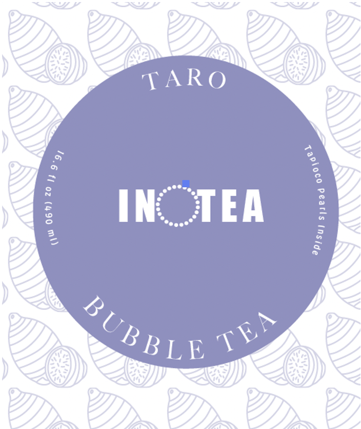
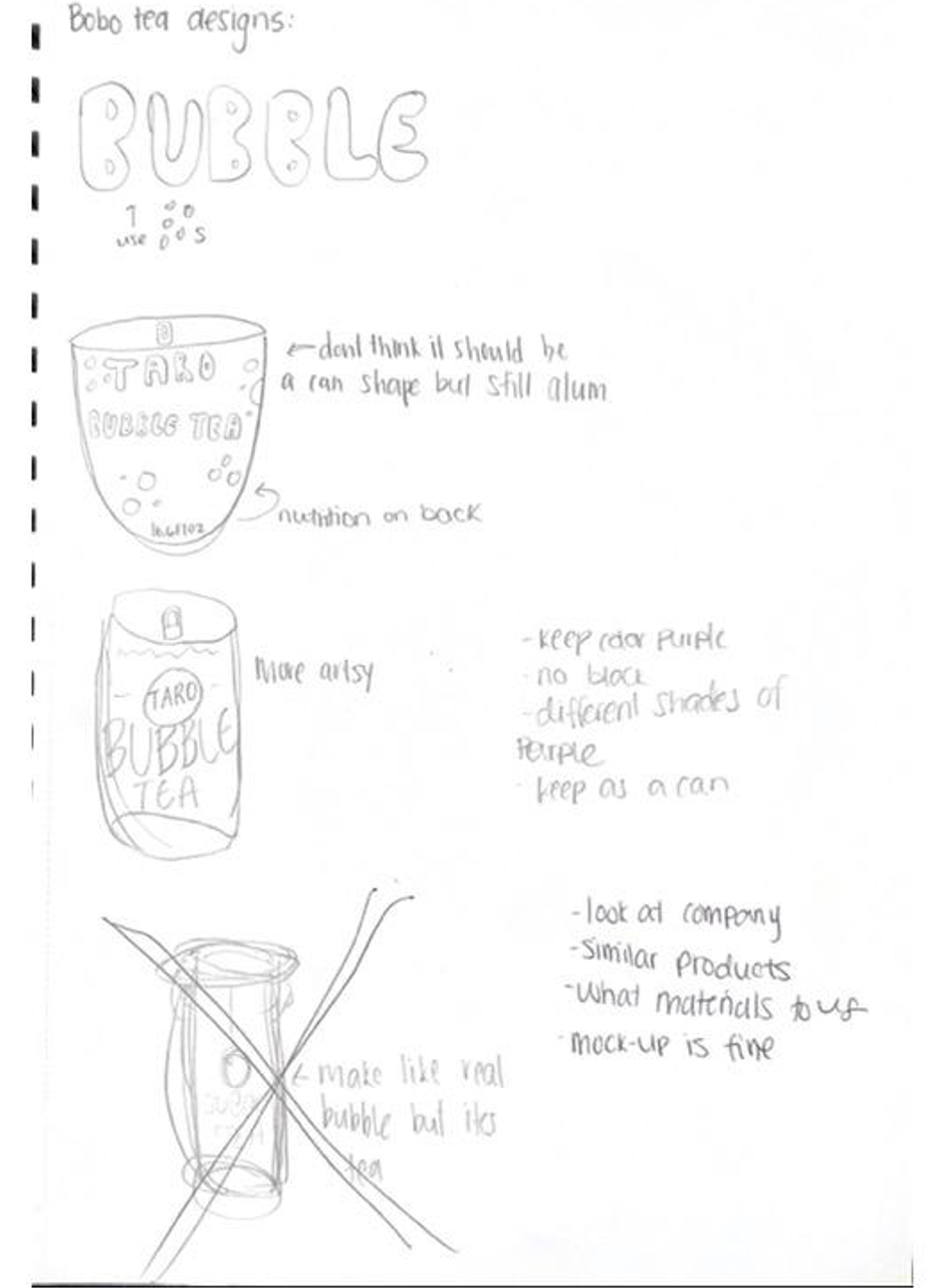
To make this project the idea was to think of something you have seen in the grocery store that I immediately saw and thought needed to be re done. I brainstormed different brands and companies that I see and use everyday. It was hard for me to come up with something immediately so I went to the closest Harris Teeter. I scanned the aisles trying to find a product that caught my eye, in a bad way. I stumbled across the international foods aisle and my eyes went straight to the product I chose. This product was INOTEA Bubble Tea. To me it looked like it would be an energy drink, due to its harsh coloring and shadows. I knew that there was a better way to create the packaging of this product. It lacked visual appeal and value to the main idea of the product. In the fiercely competitive tea industry, packaging plays a crucial role in differentiating products. A well-executed redesign can give INOTEA a competitive edge by making its products stand out on the shelves and appeal to a broader audience. A package redesign offers the opportunity to refresh and modernize the brand's image. Redesigning the packaging to use brighter colors that feel more “cute” like many would envision bubble tea. This, in turn, can change someone's reasoning to picking it off the shelf or not. INOTEA has a golden opportunity to reinvigorate its brand by addressing the shortcomings of its current packaging. For them a change in character and thoughtfulness of its audience could elevate its image, enhance customer satisfaction, and align the brand with contemporary market trends. The benefits of a package redesign extend beyond aesthetics; they hold the promise of a brighter, more competitive future for INOTEA in the dynamic world of tea retail.
I believe my design brought in the “cute” aesthetic of bubble tea and a lot more enticing for the crowd who drinks it. Using a pattern of the tapioca flavor for the background and using a bubble like text.
bubble tea product rebrand


